Display Oceanographic Data on the Chart
To display oceanographic data on the map, press the “More” button (1) at the bottom right of the screen. Then activate the “Ocean-O” screen by pressing button (2).
A “Ocean-O” icon will appear above the “More” button (4), indicating that the screen is active.
Seven layer buttons (3) will also appear on the right side of the screen.
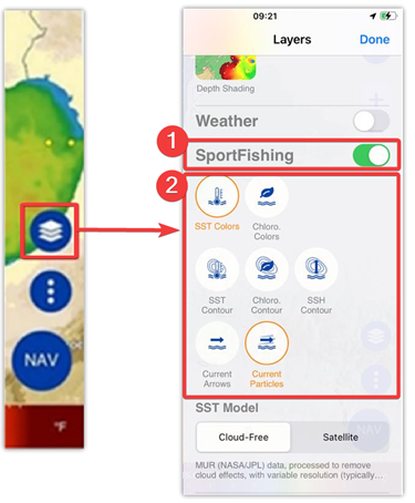
How to Choose Layers
The data can be displayed in either color gradient mode or contour lines, depending on the selected layers.
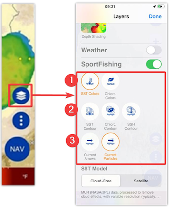
- Color layers:
- SST Colors (Sea Surface Temperature)
- Chloro. Colors (Chlorophyll concentration in color)
- Contour layers:
- SST Contour (Temperature contour lines)
- Chloro. Contour (Chlorophyll contour lines)
- SSH Contour (Altimetry contour lines)
- Arrows & Particles layers:
- Currents (Arrows)
- Currents (Particles)
Examples of display:
 |
SST Colors: |
 |
SSH Contour: |
 |
SST Colors & SSH Contour |
You can combine almost any layer, allowing you to pinpoint areas where conditions are favorable for fish, such as thermal breaks, upwellings or areas rich in phytoplankton.
Cursor Information

Notes: This information is available in both 'Online' and 'Offline' modes. In online mode, oceanographic data such as SST, SSH, chlorophyll and current are always displayed in the cursor information. In offline mode, values are only displayed if data has been downloaded.
Choose your SST Data Model, Cloud-Free or Satellite
The Ocean-O service offers two display models for SST: “Cloud-Free” and “Satellite”.
The “Satellite” model is preferable if the observed area is cloud-free, as it is extremely accurate. But if the observed area is cloudy, use the “Cloud-Free” model. This model is generated from mathematical models, using several data sources as inputs, and enables SST to be calculated and represented where cloud cover prevents satellites from observing the earth's surface. The drawback: the resolution of the data is lower.
 |
Cloud-Free SST Model (without clouds): MUR (NASA/JPL) data, processed to remove cloud effects, with variable resolution (typically 4 km) |
 |
Satellite SST Model: ACSPO (NOAA) data, unprocessed, may include gaps due to clouds, with high resolution (2km). |
Please note that model changeover is only possible when you are in “Online” mode.
When you are in “Online” mode (only), you can switch from the “Cloud-Free” model to the “Satellite” model:

When you're in “Offline” mode, you won't be able to switch between models. The "SST Model" remains selected on the model chosen at download and cannot be modified.
For more information, please refer to the "Download oceanographic forecasts" chapter.
Data Legend in Colors Mode
When you activate a layer in “Color” mode, a color scale appears at the bottom of the screen. This indicates the corresponding values associated with each color for SST or Chlorophyll.

- Button to switch to Manual mode
- Temperature or chlorophyll values and color gradient.
- Units: °C or °F for SST - μg/L for Chlorophyll
The color scale lets you interpret the value associated with each color for the following parameters:
SST Colors – Sea Surface Temperature
The color graph goes from dark blue (cold water) to dark red (warm water).
Example:
- Dark blue: 15°C or 59°F
- Green: 17°C or 64°F
- Red: 23°C or 74°F
Chloro. Colors – Chlorophyll concentration
The color scale represents the amount of phytoplankton (mg/m3).
Example:
- Blue: low concentration (poor water)
- Green to brown: high concentration (productive areas)
Press button (A) to switch from automatic to manual mode:
Automatic mode: (by default)
The minimum and maximum values adapt automatically to the data displayed on the screen. This is the default mode. It's very easy to use. From dark blue, coldest water, to dark red, warmest water.
Manual mode:
The manual mode allows you to reduce the temperature range to achieve greater contrast and focus more precisely on temperature values, for example to highlight temperature fronts (hot and cold zones).
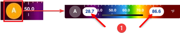
You can adjust the minimum and maximum values of the color scale to narrow or widen the range.
Tap one of the color scale limits in the legend (1).
A slider will appear, allowing you to modify the minimum and maximum values by dragging sliders (1) and (2) up or down to change the range.
