Dynamic Mooring
TZ Maps automatically classifies anchorages based on weather forecasts and topology. Everything is done automatically after selecting a date once a weather forecast is available. A color code (red, orange, green) informs you dynamically of the wind protection to come for the duration of the mooring. Mooring locations are extracted from the Vector charts, but are also created and shared by the TimeZero community.
Dynamic Mooring display
First, make sure to download a weather file (containing wind at minimum) where you want to analyze mooring locations (refer to the chapter Requesting a Weather File for more information). Then, click on the Chart button in the ribbon and select "Dynamic Mooring":
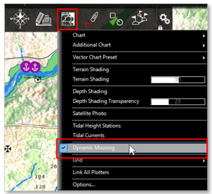
Enabling the "Dynamic Mooring" layer will display on your screen the following information:
-
the mooring icons on the chart which are color coded
-
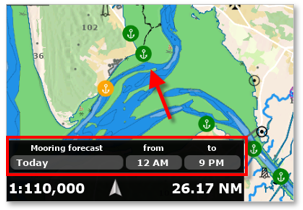
the mooring forecast adjustment box which allows you to select a date and a time span (for when you plan to anchor your vessel)
By default, and if a weather forecast is not available, the Dynamic Mooring icons will be displayed in purple:
![]()
If a weather forecast is available within the time span selected, the mooring icons will change color:
![]() Green: protected Mooring
Green: protected Mooring
![]() Orange: relatively calm Mooring
Orange: relatively calm Mooring
![]() Red: Mooring to be avoided
Red: Mooring to be avoided
![]() Grey: calculating...
Grey: calculating...
When using Dynamic Mooring, make sure to adjust the proper date and time span (located in the lower left corner of your screen). The weather might evolve and have an impact on the mooring recommendation:
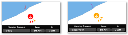
When you are zoomed in enough on the chart, the Dynamic Mooring icon will display a couple of additional information. If the mooring is near the coastline (about 330 yards or 300 meters), a rounded solid line will indicate the sheltered sector. You might also notice some arrows pointing at the anchor symbol. Each arrow represents a different hour. For example, if the wind is coming from the same direction during the mooring duration, you should only see one arrow. This will indicate that the wind will not shift while you are anchored. However, if you see multiple arrows in various directions, it means that the wind will shift during that time:
![]()
The color of the arrow takes into account the wind speed but also the topology. For example, a strong wind coming from a protected direction might still be displayed as a green arrow.
TIP: If several arrows are positioned in the same direction, the most "dangerous" color will be displayed (indicating the stronger wind).
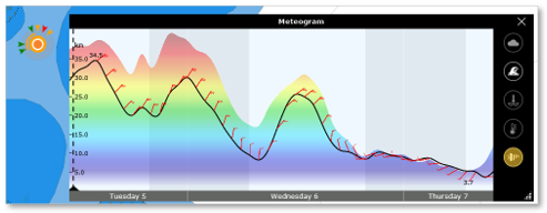
For deeper understanding of the wind pattern, it is possible to display a "Meteogram" at the mooring location.
Simply right click on the mooring icon and select "Show Meteogram" from the pop-up menu. This will display a graph with the wind speed and direction evolving over time. You can also add additional parameters to the meteogram such as wave direction and wave height:
Edit or add your own Dynamic Mooring
Mooring locations are initially extracted from the Vector charts data, but users can improve this data by either modifying existing moorings (for example, moving a mooring to a more accurate location), or create entirely new moorings. Behind the scene, the Community Maps are used to store all these modifications.
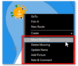
To edit an existing mooring, simply click on it and select among the following options:
-
Move Mooring
-
Delete Mooring
-
Update Name
-
Add Picture
-
Rate & Comment
To add a new mooring location, just click on the chart at the location you would like to create the mooring, then select “Create” and “Mooring” from the drop down menu.
Create Temporary Mooring
You can also create a temporary mooring to pre-evaluate a day for a specific date without adding it to the community layer.
To do this, right-click on the chart and select "Create Temporary anchorage". An anchorage icon will then be displayed at this location, with characteristics similar to those described above.
![]()
Note: The anchor on the temporary icon is black instead of white, as with other moorings.